
Homestead Butter
Homestead Butter
Packaging
Packaging
Create a cohesive design identity for a potential product in H-E-B grocery stores.
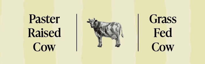
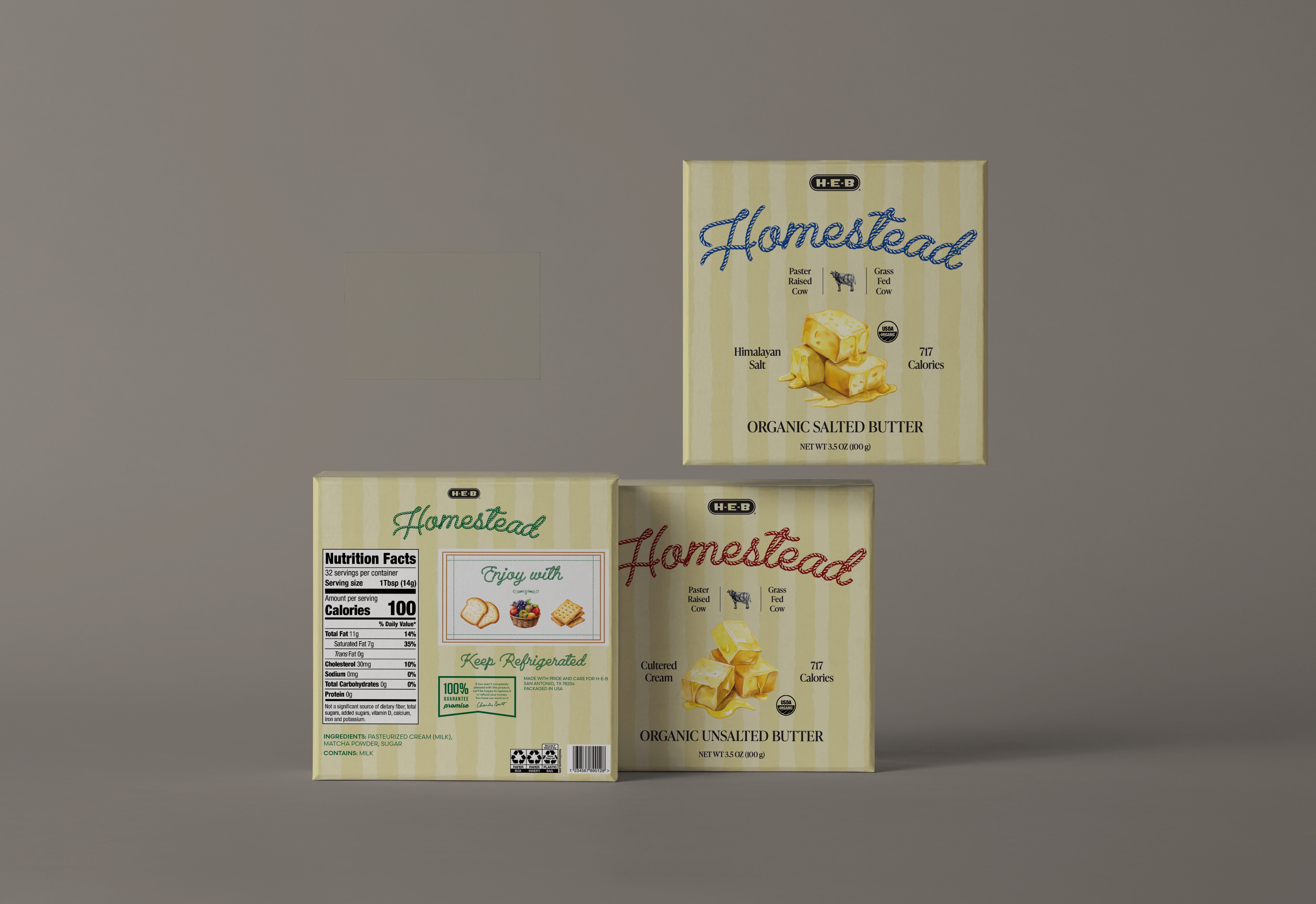
H-E-B represents a high-tier brand. By that, I used soft cream background, cursive rope font, and a minimalist layout that leans into a heritage, handcrafted feel. The design highlights premium cues such as cultured cream and pasture-raised sourcing, signaling quality and care.
Create a cohesive design identity for a potential product in H-E-B grocery stores.
H-E-B represents a high-tier brand. By that, I used soft cream background, cursive rope font, and a minimalist layout that leans into a heritage, handcrafted feel. The design highlights premium cues such as cultured cream and pasture-raised sourcing, signaling quality and care.
Create a cohesive design identity for a potential product in H-E-B grocery stores.
H-E-B represents a high-tier brand. By that, I used soft cream background, cursive rope font, and a minimalist layout that leans into a heritage, handcrafted feel. The design highlights premium cues such as cultured cream and pasture-raised sourcing, signaling quality and care.




HCF Butter
HCF Butter
Packaging
Packaging
Hill Country Fair represents the mid-tier brand. The design features a green grass background, bold banners, and playful cows and sheeps, creating a fun and approachable look. It feels friendly and accessible for everyday use, prioritizing visibility and value.
Hill Country Fair represents the mid-tier brand. The design features a green grass background, bold banners, and playful cows and sheeps, creating a fun and approachable look. It feels friendly and accessible for everyday use, prioritizing visibility and value.
Hill Country Fair represents the mid-tier brand. The design features a green grass background, bold banners, and playful cows and sheeps, creating a fun and approachable look. It feels friendly and accessible for everyday use, prioritizing visibility and value.


© 2026 Truc Ivy Nguyen
All Rights Reserved